—
“Arizona Coyotes: We Hockey”
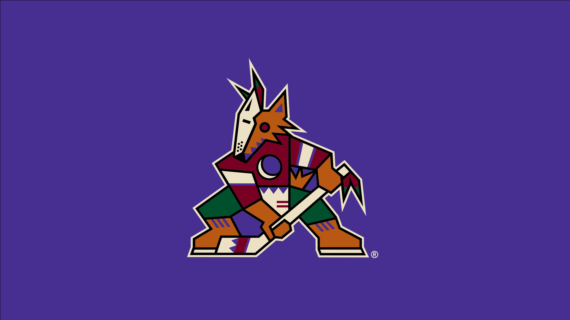
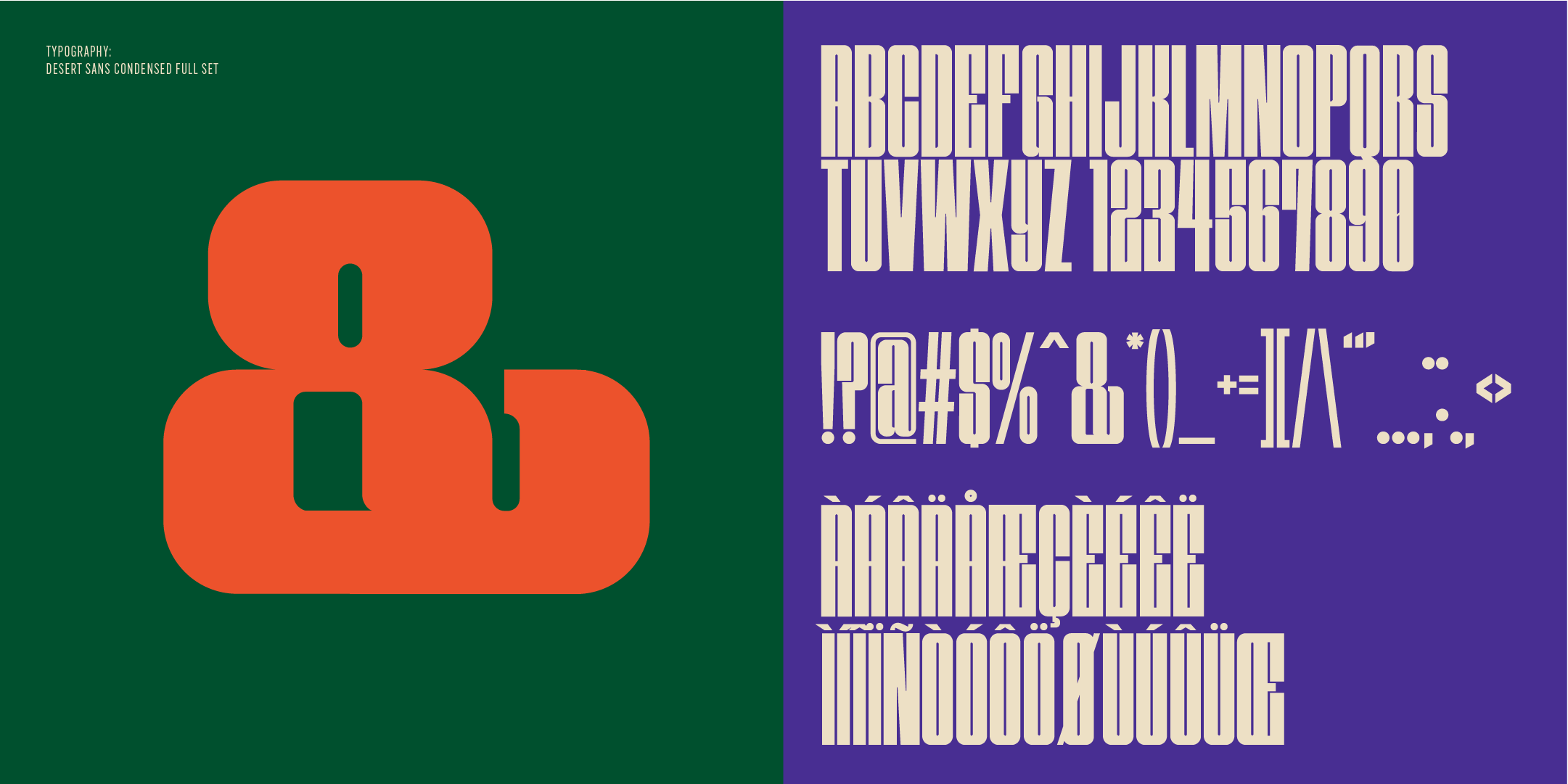
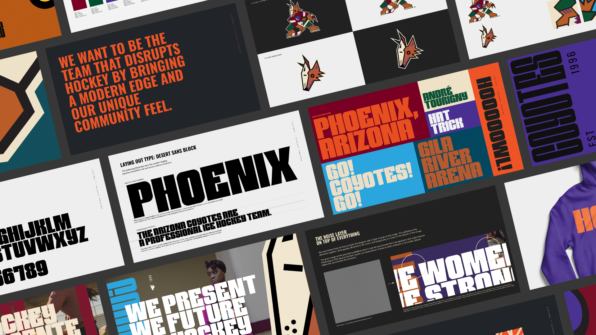
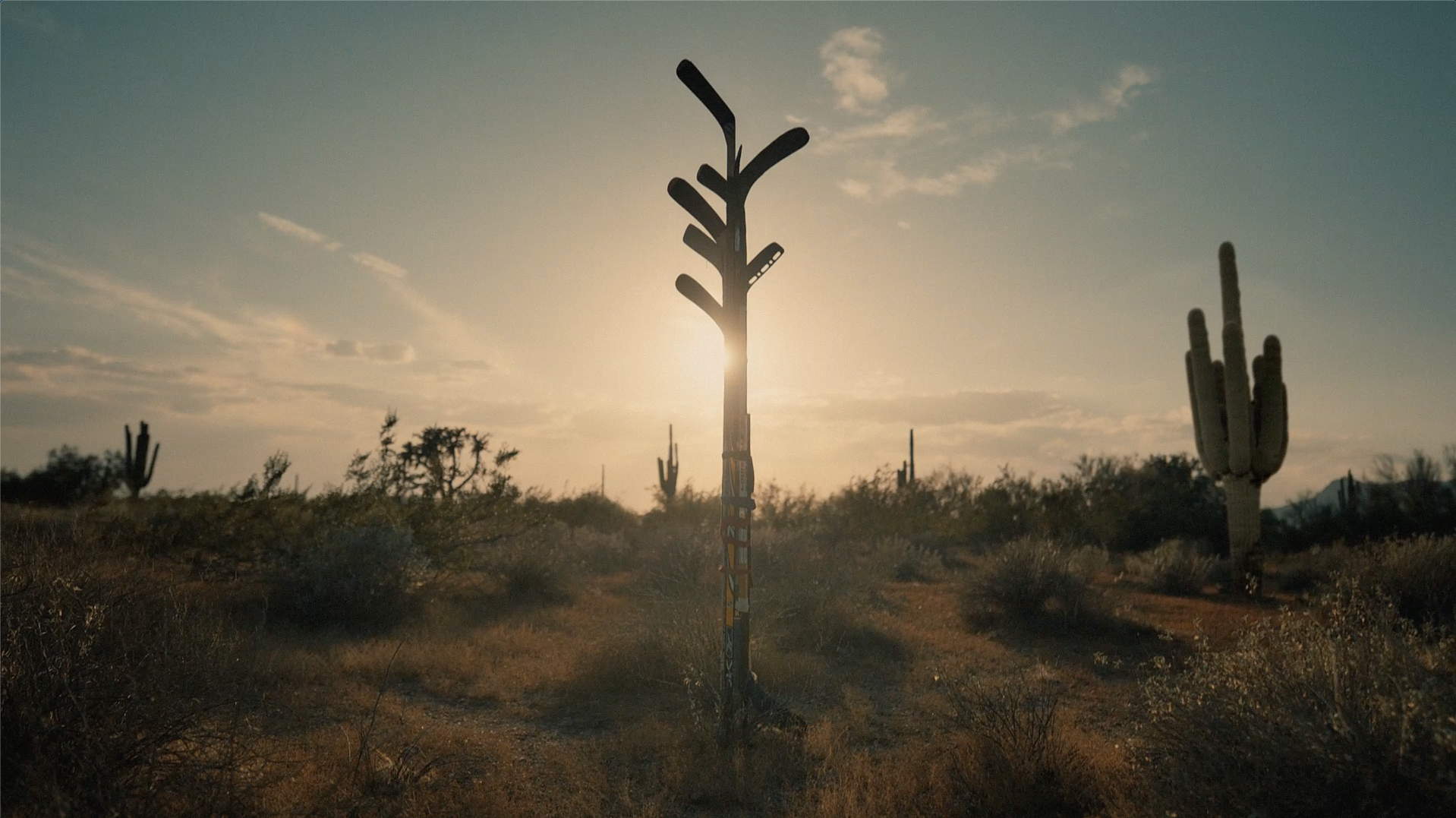
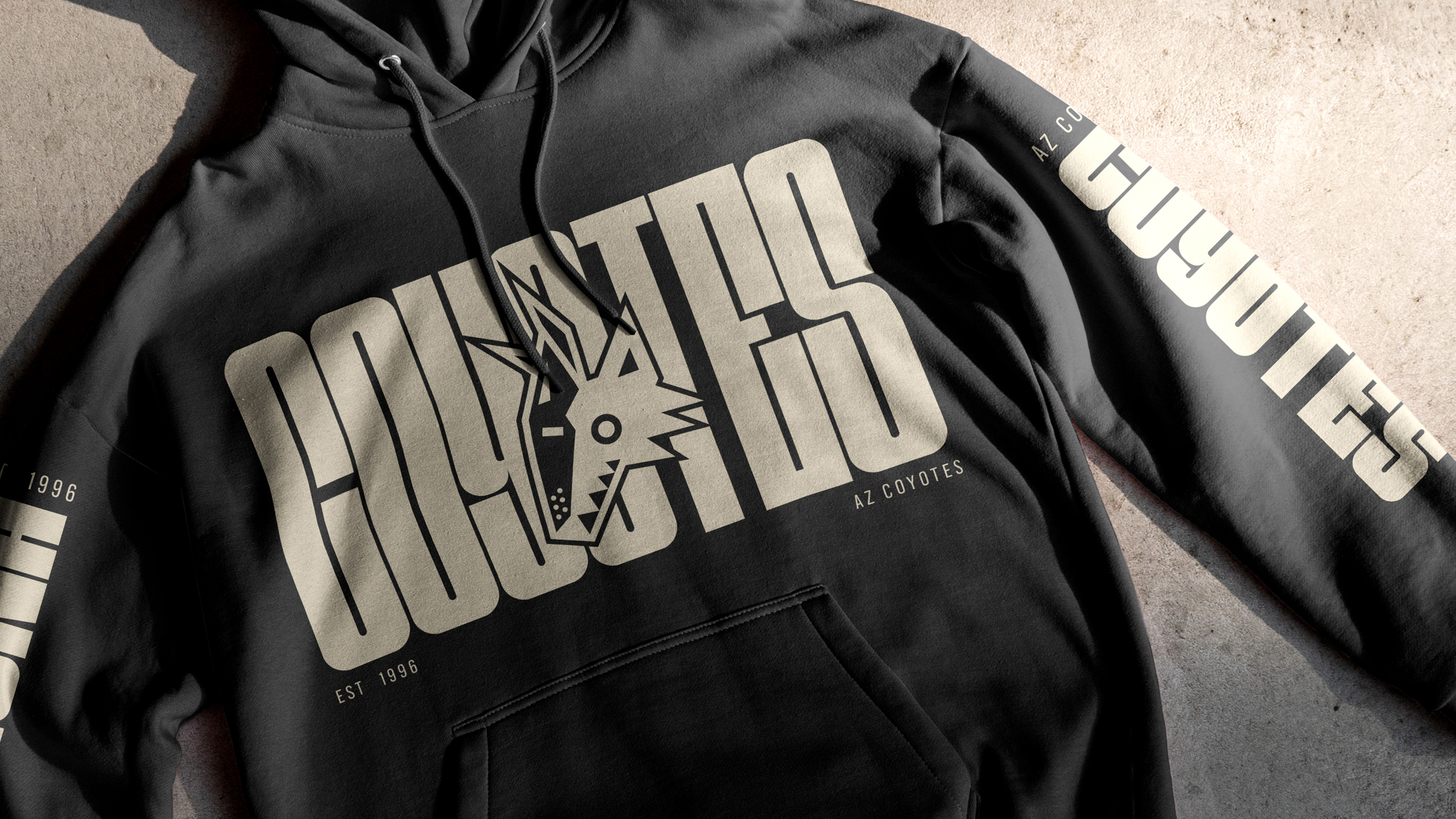
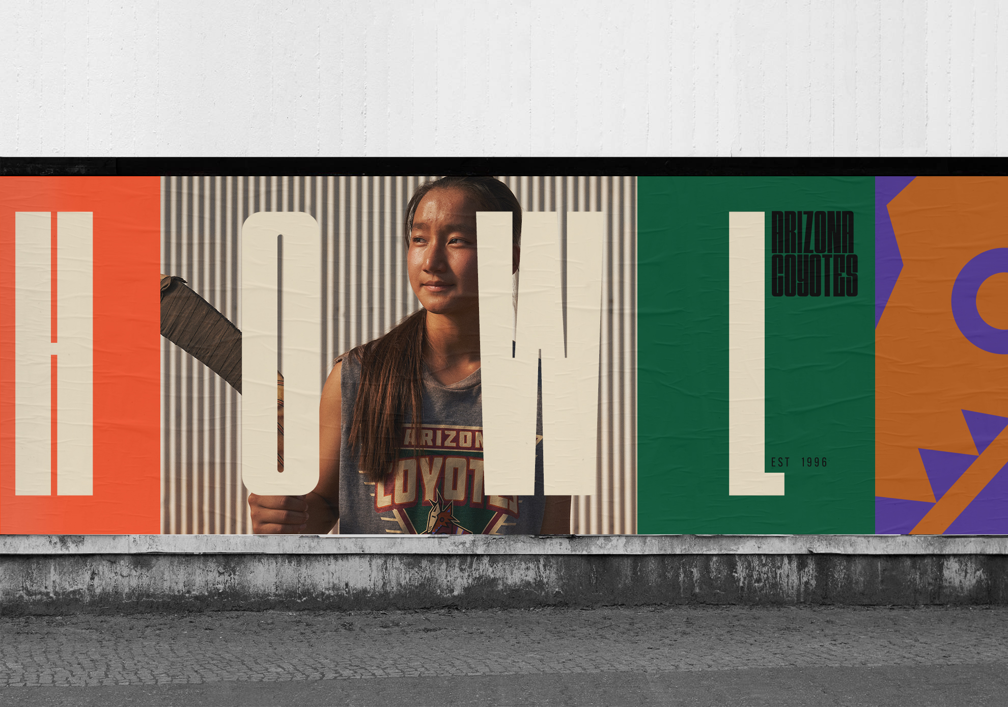
The Arizona Coyotes had a mission to bring their brand into the forefront of diversity for the sport of hockey. The reconstruction of the brand started with a look back into the design roots of their brand and the rich cultural heritage of Arizona. Accompanying the decision to re-enlist the usage of their original Kachina Mask logo from the 1990s, we designed a modular design layout system comprised of two brand new Display Typefaces and an unhinged color system.
2022 Silver Cannes Lion Award Winner
2022 Clio Silver Award Winner
“Arizona Coyotes: We Hockey”
Brand Identity Design, Typography Design, & Campaign Design
2021 — 2022
The Arizona Coyotes had a mission to bring their brand into the forefront of diversity for the sport of hockey. The reconstruction of the brand started with a look back into the design roots of their brand and the rich cultural heritage of Arizona. Accompanying the decision to re-enlist the usage of their original Kachina Mask logo from the 1990s, we designed a modular design layout system comprised of two brand new Display Typefaces and an unhinged color system.
The redesign of this brand thinks of hockey not how it currently is, but how it could be.
2022 Silver Cannes Lion Award Winner
for Brand Building Rebrand/Refresh of an Existing Brand
2022 Clio Silver Award Winner
for Design & Corporate Branding
︎ Arizona Coyotes Clio Awards Case Study